Collage.com Graphic Design
Graphic Design
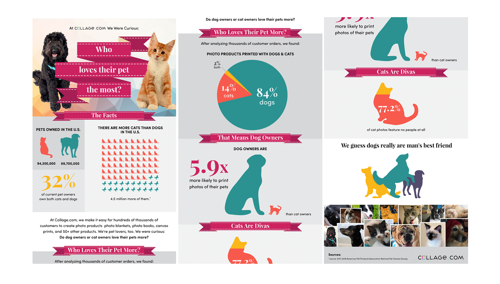
Icon Design / Illustration / InfoGraphicsFull-Size Imagery
<---- previous next ---->
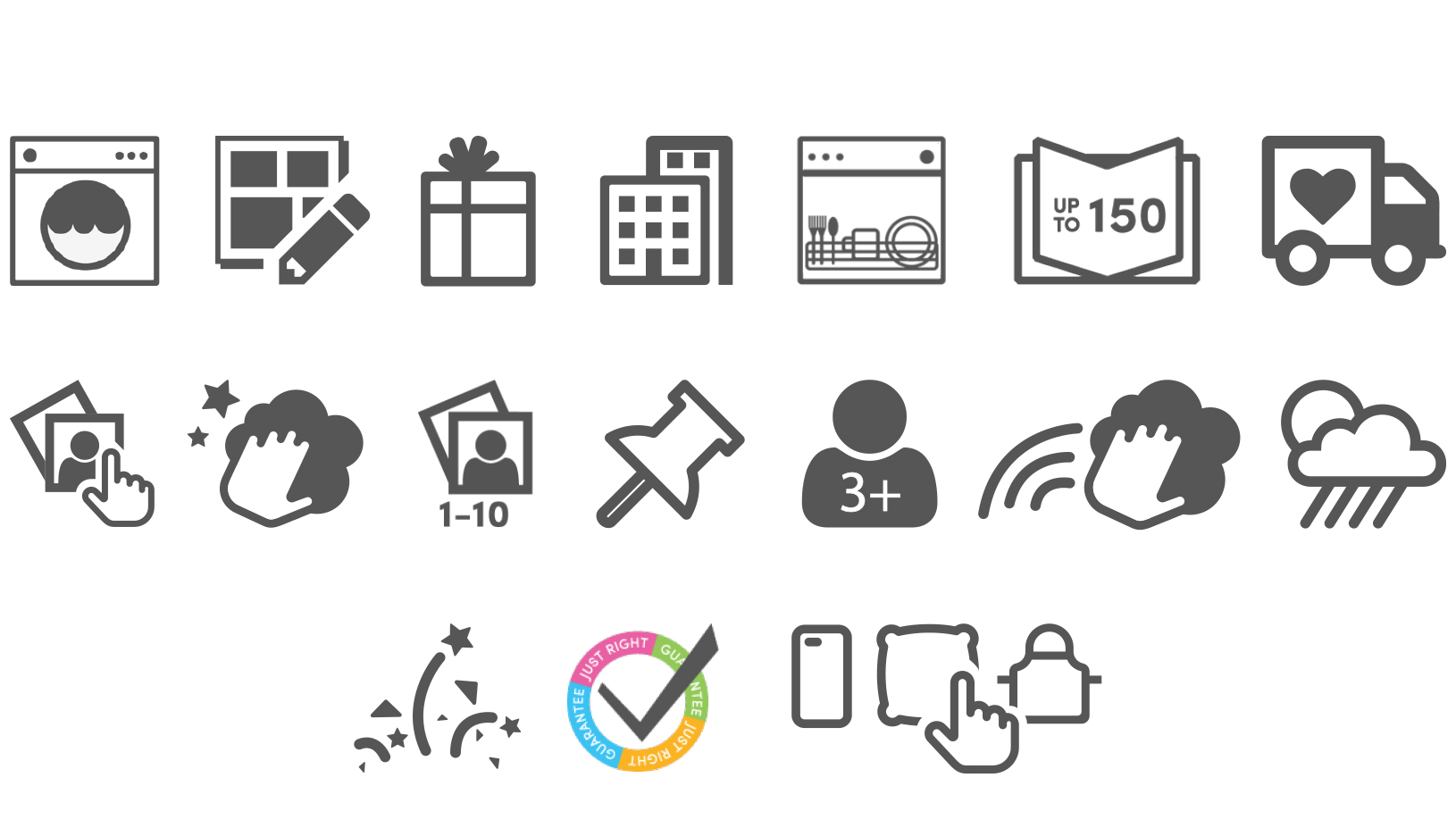

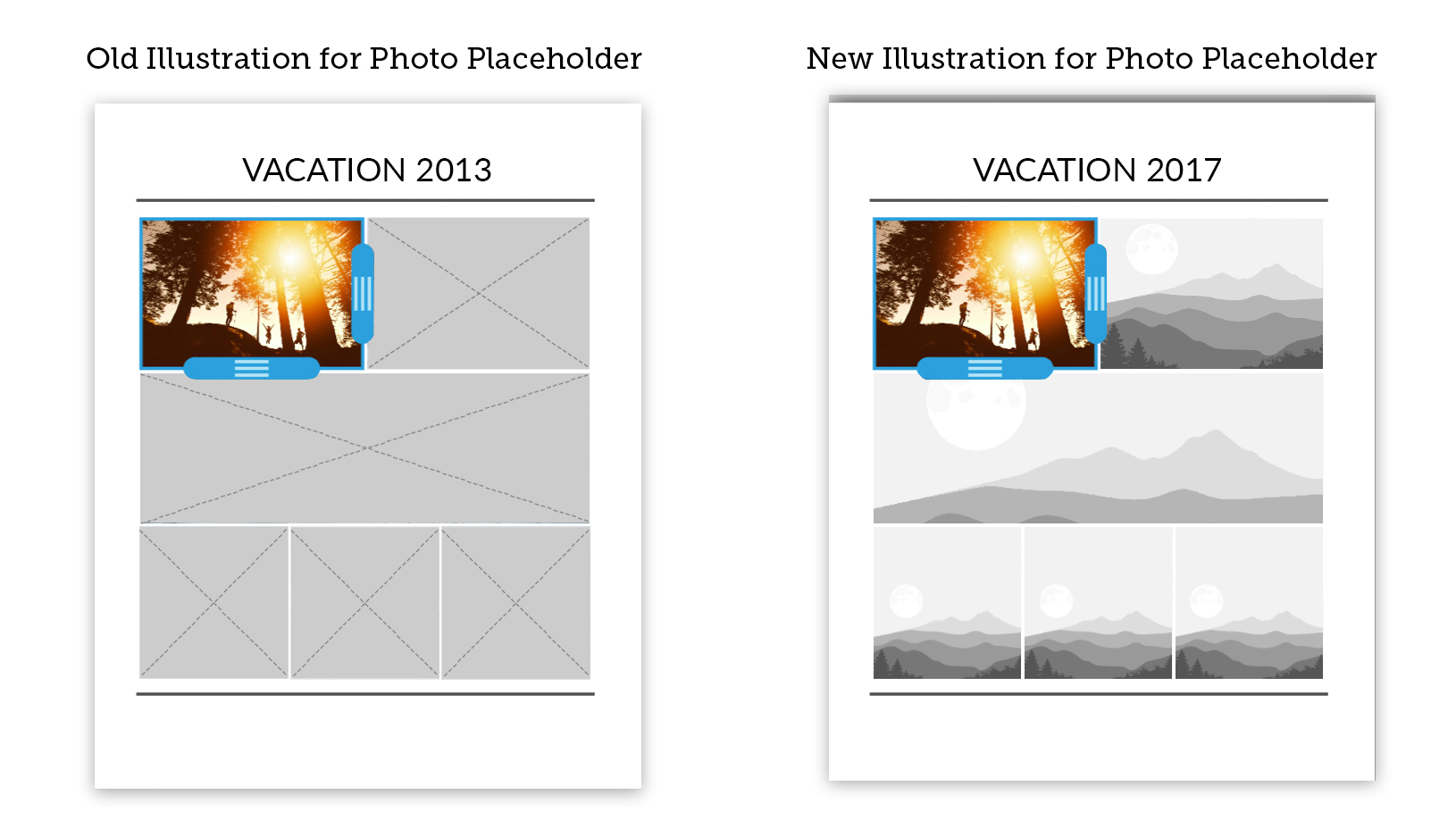
My time with Collage.com yielded many opportunities to pivot to design work that could simplify the customer experience. My goal at all times was "if it can be said in a pictogram, do that," as a common issue was no one wants to be forced to read anything. Recognizability is always difficult when taking an abstract concept to an uninitiated stranger, but I found these icons, illustration and infographic not only sold the concept but had a fair eight year run as well.